WTH Construction is a company based in Lafayette, Louisiana. Led by William “Billy” Hughes, they specialize in residential and commercial construction, offering services like new home builds, renovations, remodeling, home additions, and interior and exterior finishing.
Billy Hughes, who founded the company, has over 20 years of experience in the construction industry and emphasizes combining high-end quality with affordability. His approach bridges the gap between custom and production homes, providing personalized attention and craftsmanship while maintaining competitive pricing. The company prides itself on its commitment to customer service and quality, reflected in numerous satisfied customer reviews.
WTH Construction is involved in every step of the building process, from consultation and planning to construction and finishing. They handle everything from small renovations to large-scale commercial projects, ensuring each client’s vision becomes a reality. Additionally, the company supports the local community through its services and contributions to local businesses.
The goal of the redesign was to create a website that:
- Enhances usability by making it more intuitive for visitors to navigate.
- Improves accessibility for a broader audience, including those with disabilities.
- Clarifies services by explaining each offering in detail.
- Reflects modern design standards, making it aesthetically appealing and professional.
- Easy to update and maintain using WordPress as a CMS facilitates site management and security with relevant plugins.
Challenges
- Complex Service Offerings: WTH Construction provides a wide array of services ranging from home building and commercial projects to renovations, making it crucial to organize and explain each service in a clear, user-friendly manner.
- Outdated Design: The original website had a traditional, static design, which made it difficult for users to quickly find information or navigate between service categories. Also, the static pages were difficult to modify without changing the HTML code directly.
- Limited Accessibility: The previous version of the website did not meet modern accessibility standards, potentially alienating users with disabilities.
- Lack of Engagement: The absence of interactive elements and a visual hierarchy resulted in a lack of engagement, leading to high bounce rates.
Solutions
Modernized Design
The website redesign incorporated a clean, modern layout that highlights the company’s key services and expertise. By using a grid structure and white space strategically, the design improved readability and made the site feel more welcoming. The overall design focused on simplicity and professionalism to match WTH Construction’s reputation for high-quality craftsmanship.
Improved Usability
Navigation was optimized through a well-structured menu and clear call-to-action buttons. Each service category (e.g., Home Construction, Renovation & Remodeling, Commercial Construction) was given its page, allowing users to easily explore services without being overwhelmed. Additionally, visual cues such as icons and headings helped guide users to relevant sections.
Enhanced Accessibility
To make the site more inclusive, it was redesigned to comply with WCAG 2.1 standards. Key accessibility features include:
- Alt text for images.
- Keyboard navigability for users who cannot use a mouse.
- Contrasting colors to ensure readability for people with visual impairments. This made the site easier to use for a wider audience, ensuring that all potential customers could engage with the content.
Clear Explanations of Services
Each service offered by WTH Construction was broken down into concise, yet detailed descriptions. These pages include:
- Visual aids such as photos of completed projects.
- Relevant information about each service is provided in a design that makes scanning and finding relevant information easy.
Mobile Responsiveness
Given the increasing number of mobile users, the new site was designed to be fully responsive, ensuring an optimal experience across all devices. The mobile layout features touch-friendly navigation, compact menus, and easy-to-read text for smaller screens.
Improved Performance

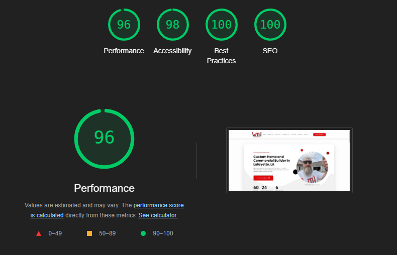
A slow-loading website can frustrate visitors and lead to higher bounce rates, impacting both user experience and search engine rankings. Recognizing this, WTH Construction’s website redesign prioritized performance optimization.
By implementing industry best practices, such as image optimization, code minification, and efficient caching, the new website loads significantly faster than its predecessor. This enhanced speed not only provides a smoother and more enjoyable browsing experience for users but also improves the website’s overall visibility and reach. Search engines favor websites that load quickly, contributing to higher rankings and increased organic traffic.
Conclusion
The website redesign for WTH Construction serves as a prime example of how a well-executed digital transformation can elevate a company’s brand and online presence. By focusing on user experience, visual appeal, and strategic content, the new website effectively showcases WTH Construction’s expertise and commitment to quality craftsmanship. The streamlined navigation, engaging visuals, and informative project galleries make it easier than ever for potential clients to explore the company’s services and past work. It is a testament to the fact that even established businesses can benefit from embracing digital innovation and adapting to the ever-evolving online market. As WTH Construction continues to grow and thrive, its new website will undoubtedly play a crucial role in attracting new clients, showcasing its capabilities, and solidifying its reputation as a construction company in Lafayette, LA.
